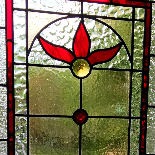
This design was taken from a book and then tweeked by me and the customer .
There are more subtleties In colour than at first obvious .
Light violet in the Center and light grey around the strong warm pink .
There should only be a small piece of the strong pink else it will take all the attention.
It’s a balancing act ....
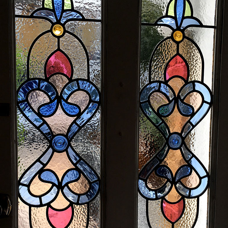
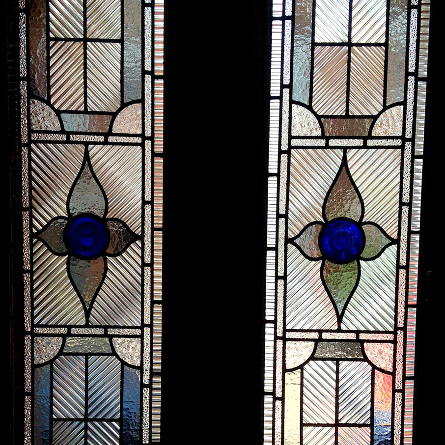
Elegant design for hallway all colours contain blue except red centres.
Makes it pop as they say....
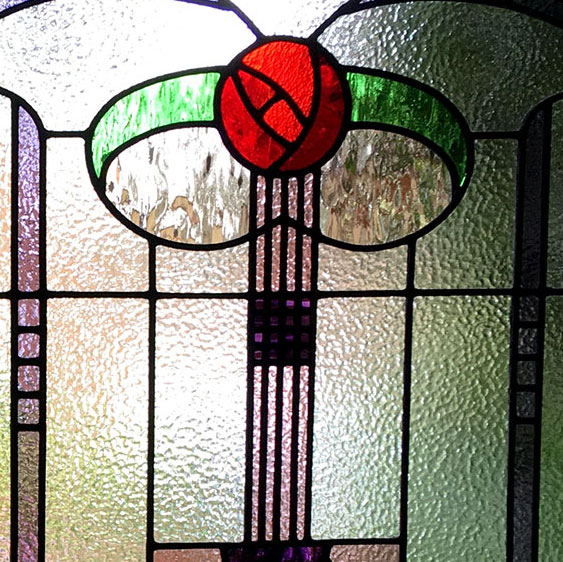
A traditional design
Violet / red and greens the blue livens it all up and harmonises things as blue is present in green and violet...
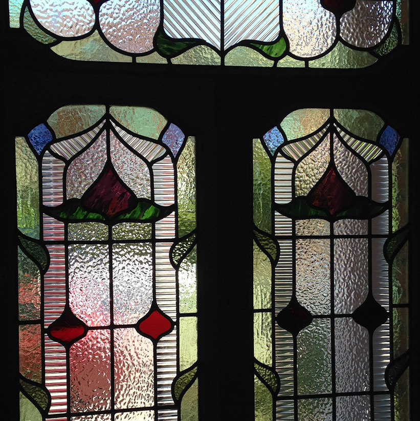
Traditional transom (or light above door).
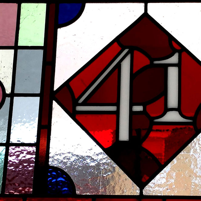
Muted colours give it age as do two different reds behind number.
The two different sized numbers add interest and work well in the diamond orientation....
Stand alone bathroom window.
Lots of different textures and odd coloured roundels to add interest ....
A traditional design with modern colourway .
Grey ,three clear textures and only one colour blue in the center.
Looks really sharp especially with white hallway with black and white tiles .
Using one colour makes this work....


